Gallery
NYC Living room
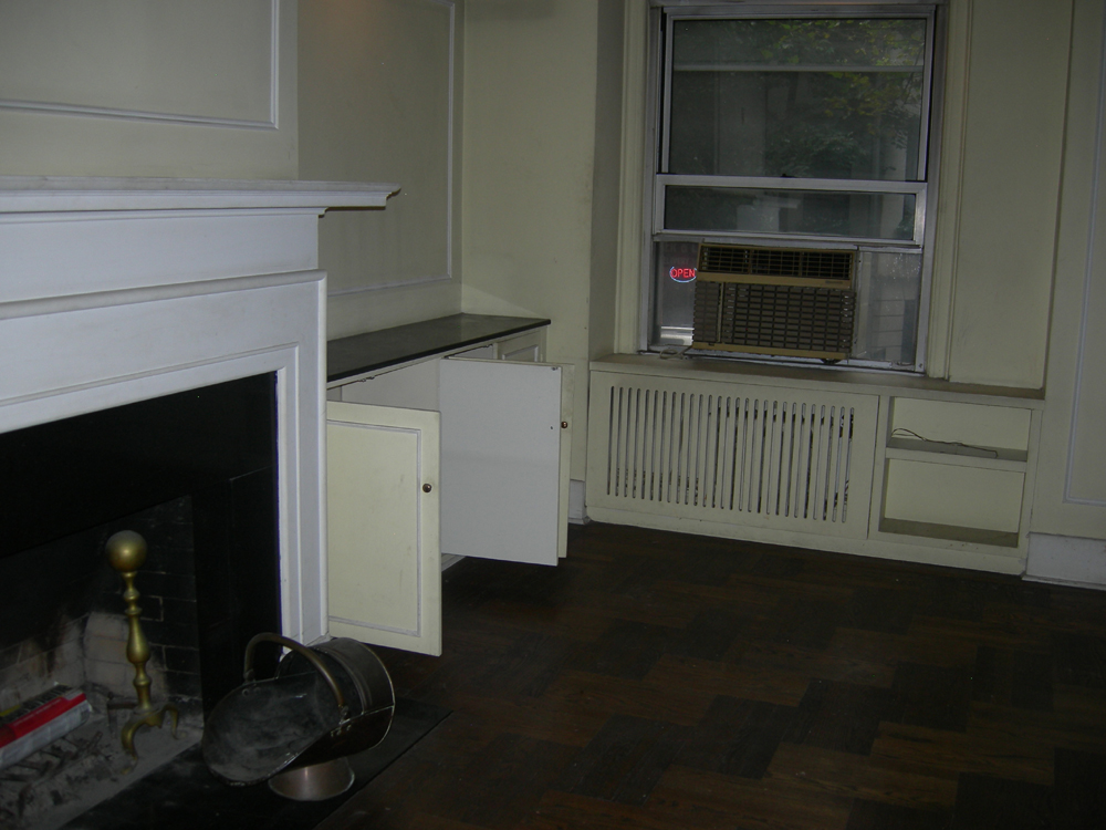
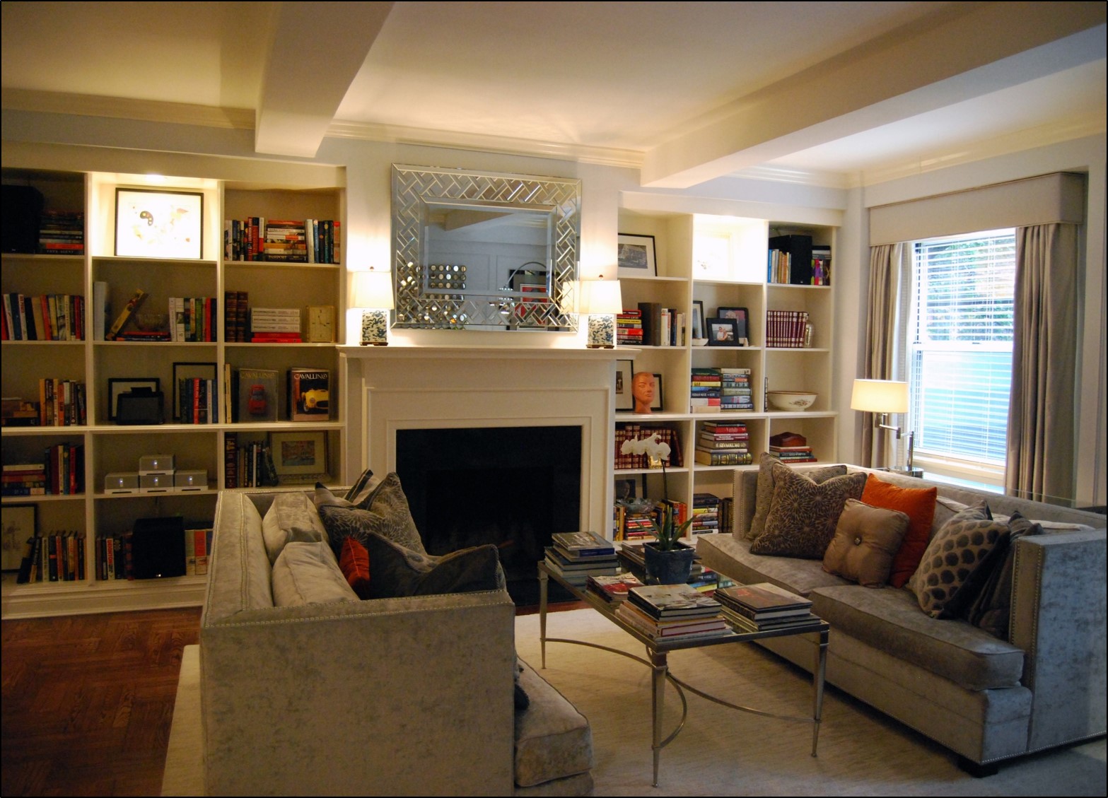
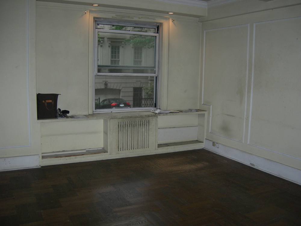
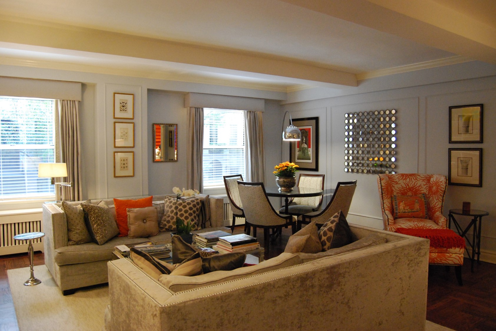
As this New York City apartment was a complete renovation, I had a blank canvas to work with. The semi-formal living room needed to include a dining area near the sunny window and sleeping ability for overnighting grandchildren.
The decorating style is a blend of Traditional, mid-century modern and French. Custom built-in bookcases were added for much needed extra storage. A light gray color scheme is punctuated with accents of orange and blue in the wing chair fabric, pillows and mantle lamps. Silk draperies, in a shade close to the wall color, disguise asymmetrical windows. The deep velvet sofas are perfect for reading, sleeping, conversation or watching tv. This high traffic space is super comfortable and highly functional, with a touch of luxury and polish.
Home Office
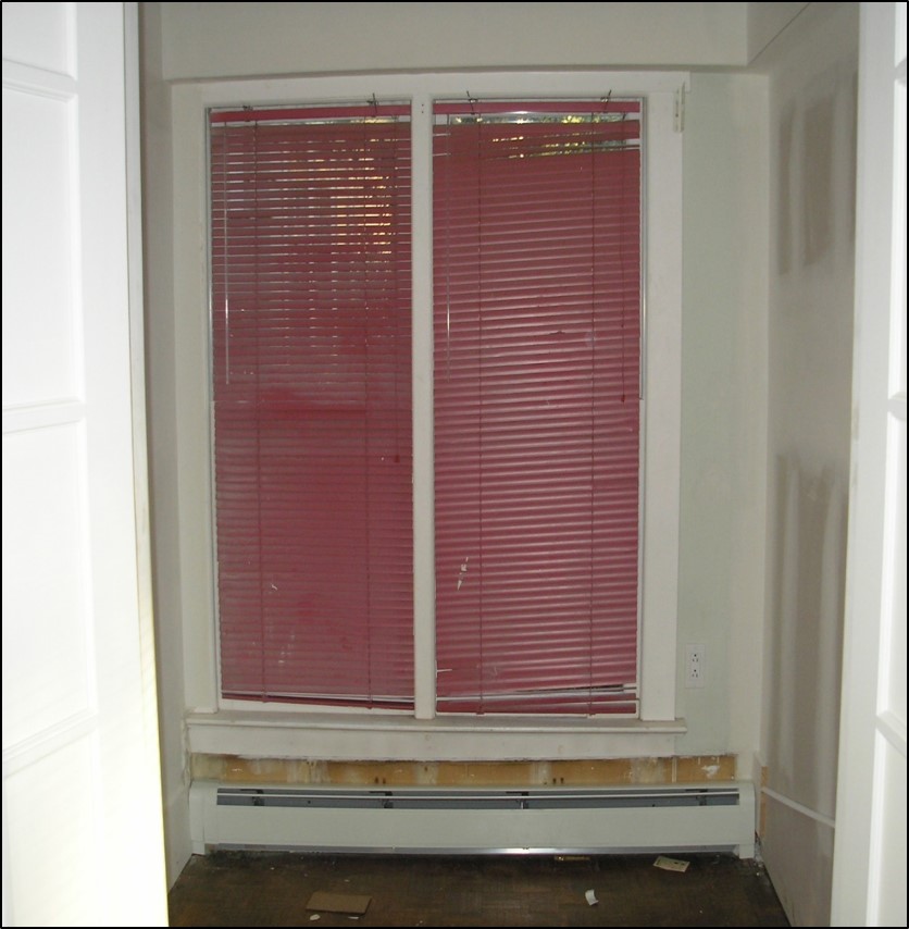
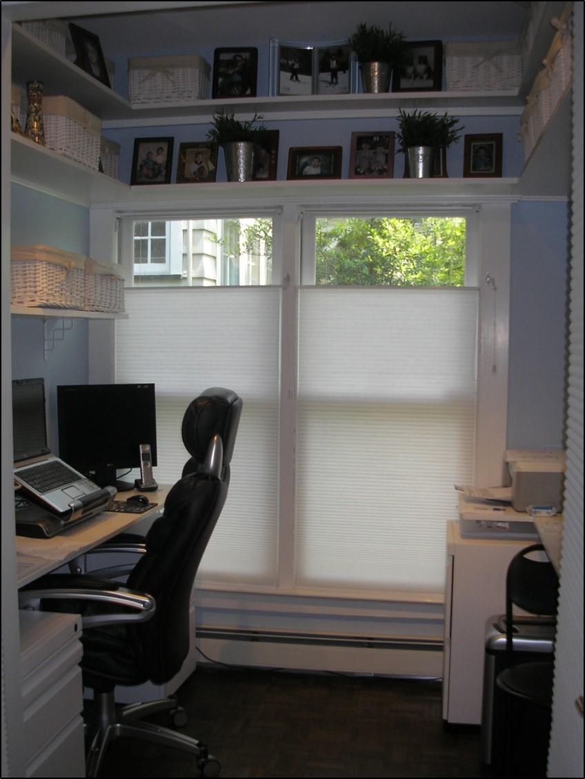
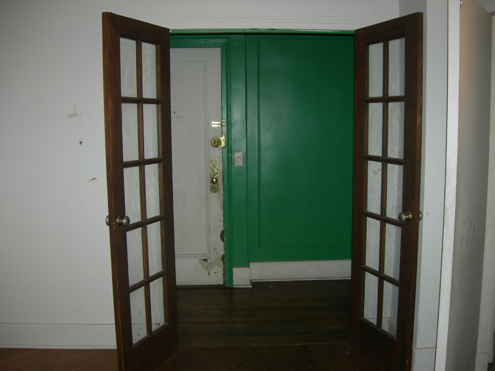
This was a small unusual6 x 6 foot square closet-like space off the dining room, with a window. Since the new homeowners had themselves just renovated and had no need for an extra linen closet or butler’s pantry, we decided to create a small personal hideaway for the man of the house to call his own.
Fully functioning office suite has a custom built-in desk, wrap around upper shelves, rolling file cabinets and French doors with privacy panels. Energy efficient top-down bottom-up shades let the light in while offering privacy from nearby neighbors. Pale blue walls, white trim and mini halogen track lighting mounted above the door frame keeps this small space feeling light, bright, open and airy.
Conference Room
Financial consultants were looking to “re-fresh” their tired, cluttered meeting space,this somewhat tight conference room. At the same time, they hoped to improve their company’s professional image, while making a more comfortable, more desirable business environment for their clientele.
I added a warm neutral paint color to the walls, and brought in new rolling arm chairs, a dark wood credenza, wall decor and table lamps. The space is much more comfortable, visually appealing with the right colors and softer lighting, and functional and organized.
Reception Area
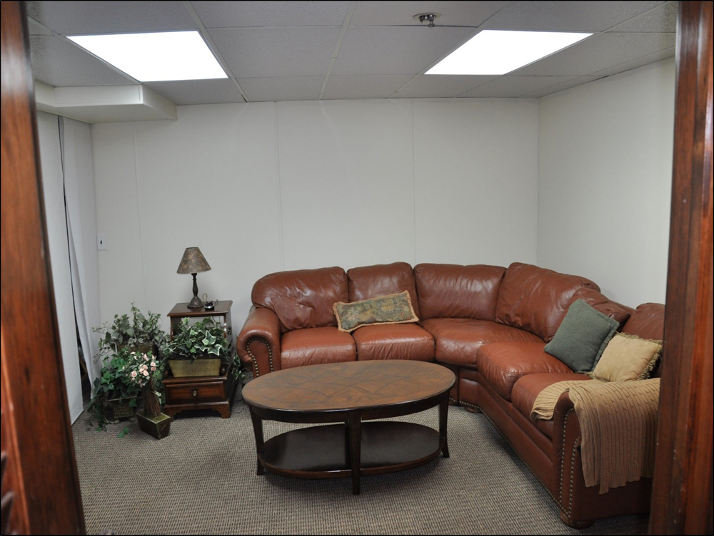
Photographer’s home-based business, a street level basement studio. Worn, traditional leather sectional furniture feels bulky and crowds the space. Yellow walls fight the gray-green tones in carpet, and overhead fluorescent lighting sets the wrong mood for this creative studio and their clientele.
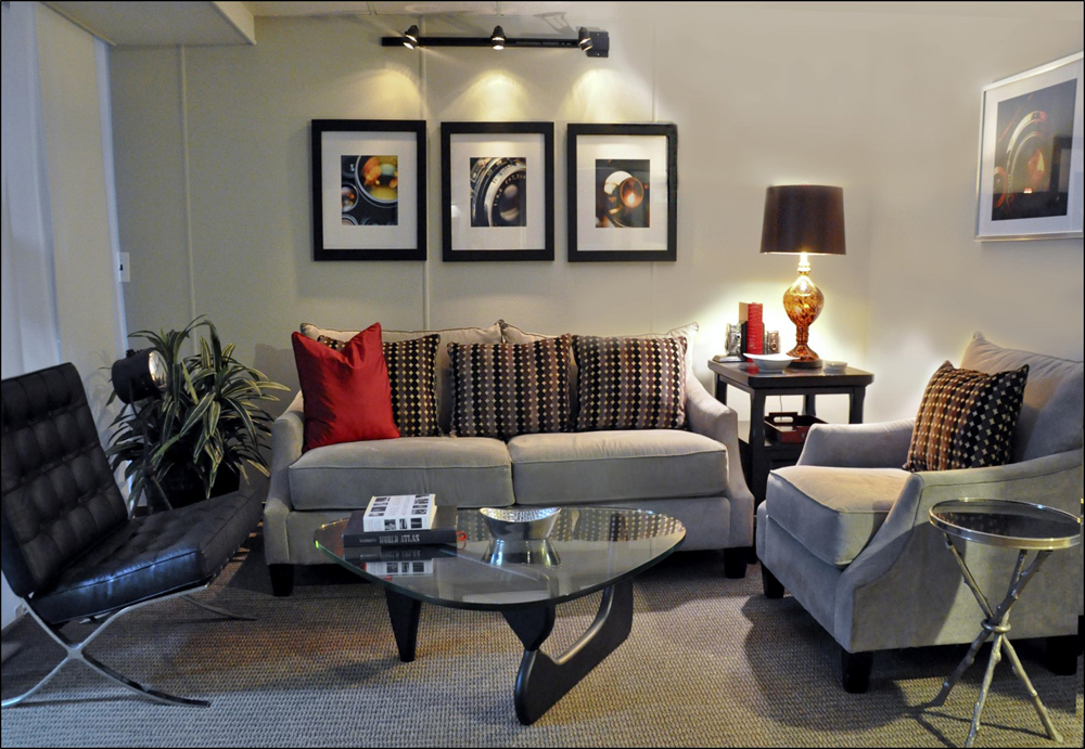
First, a color change from yellow to greige (gray/beige) in paint and plush chenille upholstery. Track lighting and table lamp warm the space and make it more relaxing. The black leather Barcelona chair, red velvet pillow, and touches of glass, marble and chrome keep it modern and upbeat. Silver camera accessories and large framed abstract photos of camera lens reflect the owner’s personality and love for nostalgia.
Bedroom
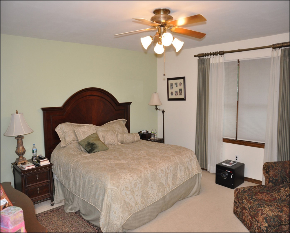
Homeowners complained about room, said it made them feel tired and drained. Space was dull, cluttered and lacking any focal point. Lamps were out of balance with the large headboard, and the cool, drab color combination of beige, gray and green is not a good choice for the bedroom.
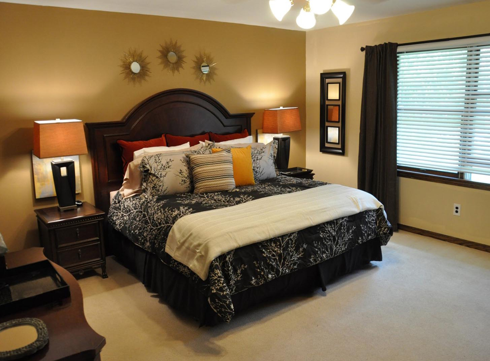
Now warm and inviting with new paint colors, I decided to add a deeper tone on the accent wall behind the dark headboard. I then added new bedding, a wood blind and curtains. Tall, modern bedside lamps balance the headboard and create a sense of order and organization, as do the sharp lines in the bold wall accessories.
Great room
My clients felt the large room adjoining their kitchen felt very bare and disconnected. They wanted a cozy, comfortable room where the whole family can read, watch tv, entertain, play cards and board games. Our inspiration began with the colorful vintage print that the clients had bought back from their 5 year stay overseas.
We created a warm, cozy, multi-functional space that could be enjoyed by the whole family. We changed paint colors on walls, ceiling and trim for a more dramatic effect and added window treatments. The new, larger area rug anchors all of the furniture pieces. A large framed “wall gallery” - featuring the young family’s favorite photos- injects the space with their fun-loving personalities and can easily be changed as often as they like.
Hallway
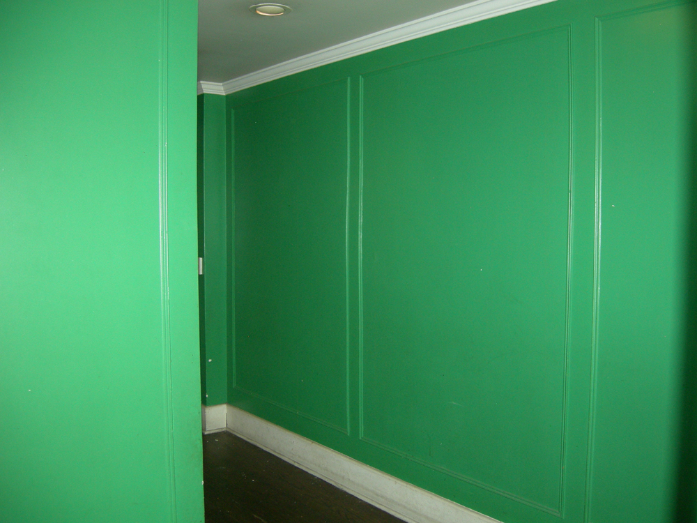
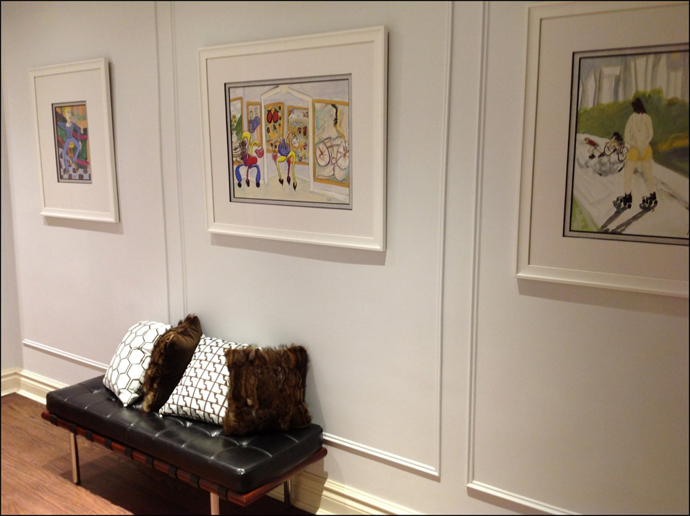
L-shaped hallway leading from the main entrance to the living room. Client had five large pieces of art that we reframed to display in the hall.
We changed wall and trim colors,added LED recessed light fixtures to the ceiling,and beveled mirror switch plates to the walls to help brighten and open up the corridor that receives no natural light. Because the hall is narrow, the only piece of furniture is a modern style black leather tufted bench.
Wall color: Benjamin Moore Bunny Gray
Living Room
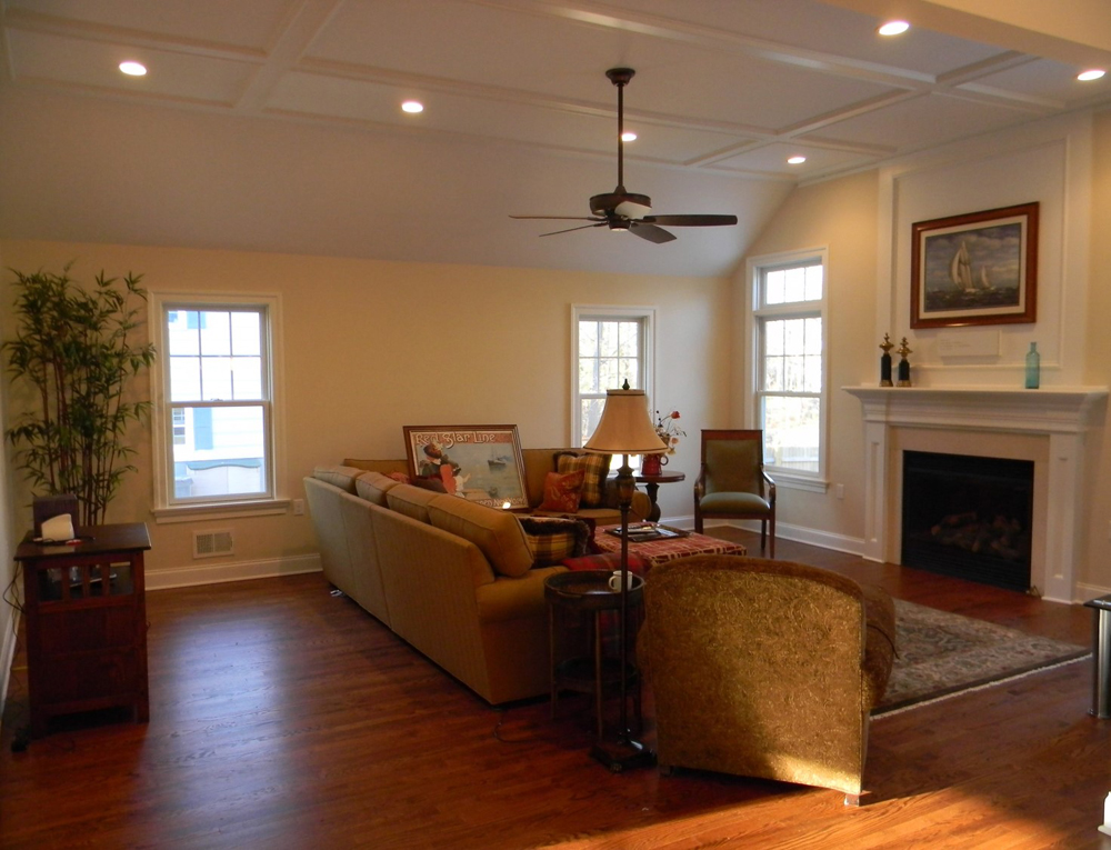
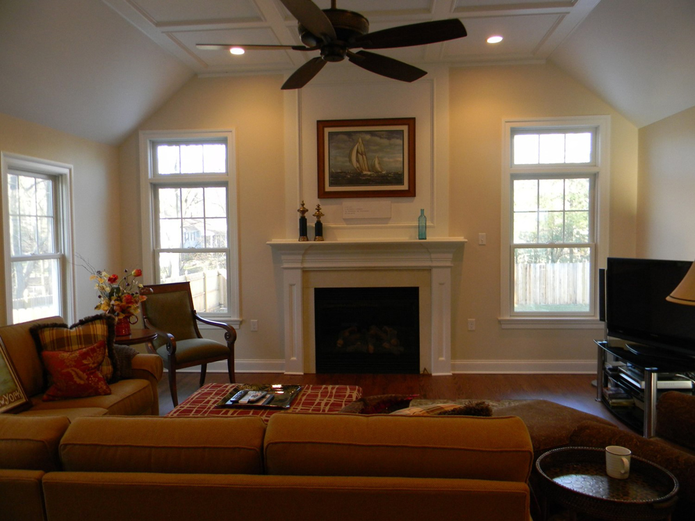
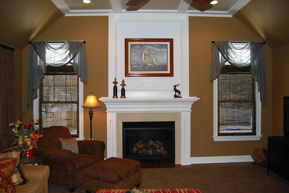
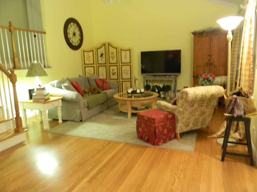
The living room furnishings were a collection of everything the new homeowners had in the living room of their previous home. They had painted this room the same color yellow they had before, for that reason.
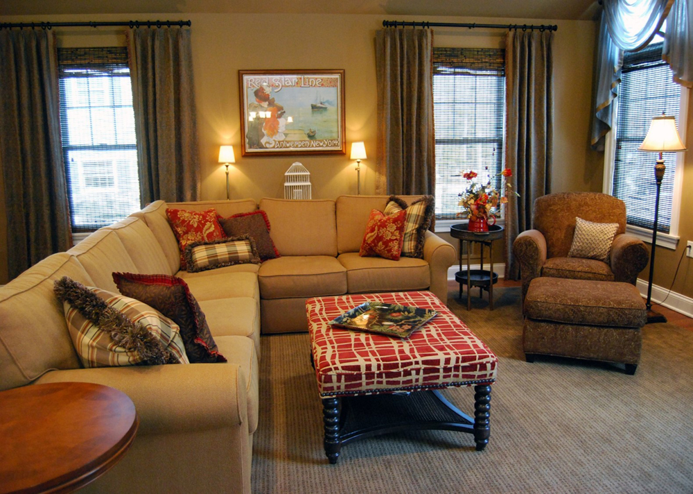
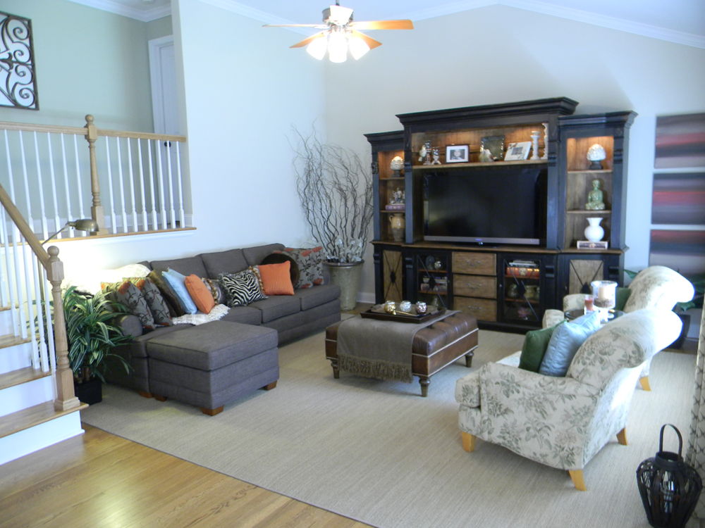
We did a complete change of pace with new furniture, carpet and window treatments, and a new wall color. We incorporated two of the existing chairs and some of the client’s decorative accessories.
Wall color: Benjamin Moore Elmira White
Bath
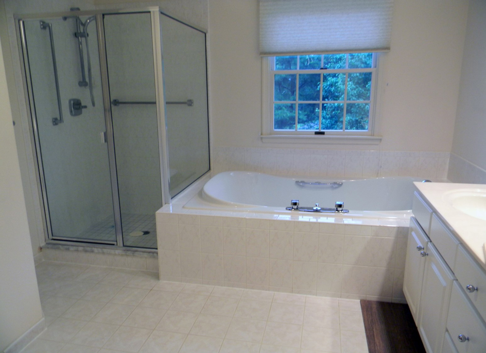
Bland and sterile ‘white on white’ is not enough in the way of style for these young first-time homeowners.
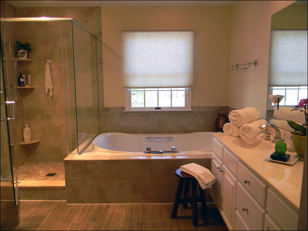
New frameless shower enclosure and assorted “organic” tiles change the look and feel of the space, by adding texture and pattern under foot. Pebble floor in shower simulates Mother Nature, the warm neutral paint color ties it all together and the now white accents keep it fresh.
NYC Master
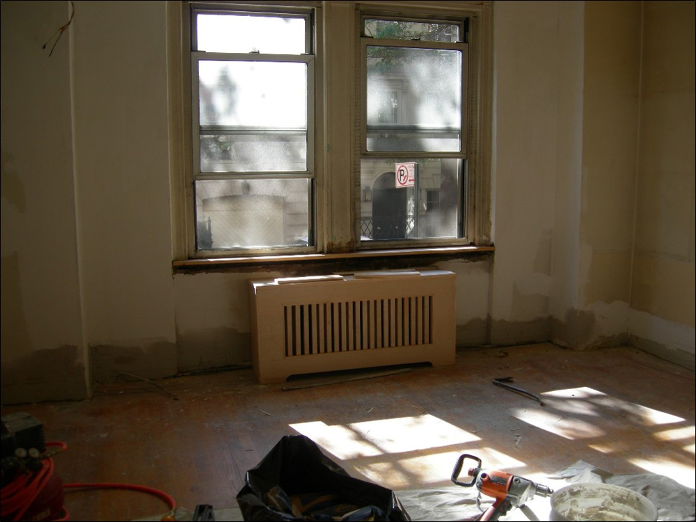
The room felt long and narrow. We gained an extra 3 feet by removing a closet.
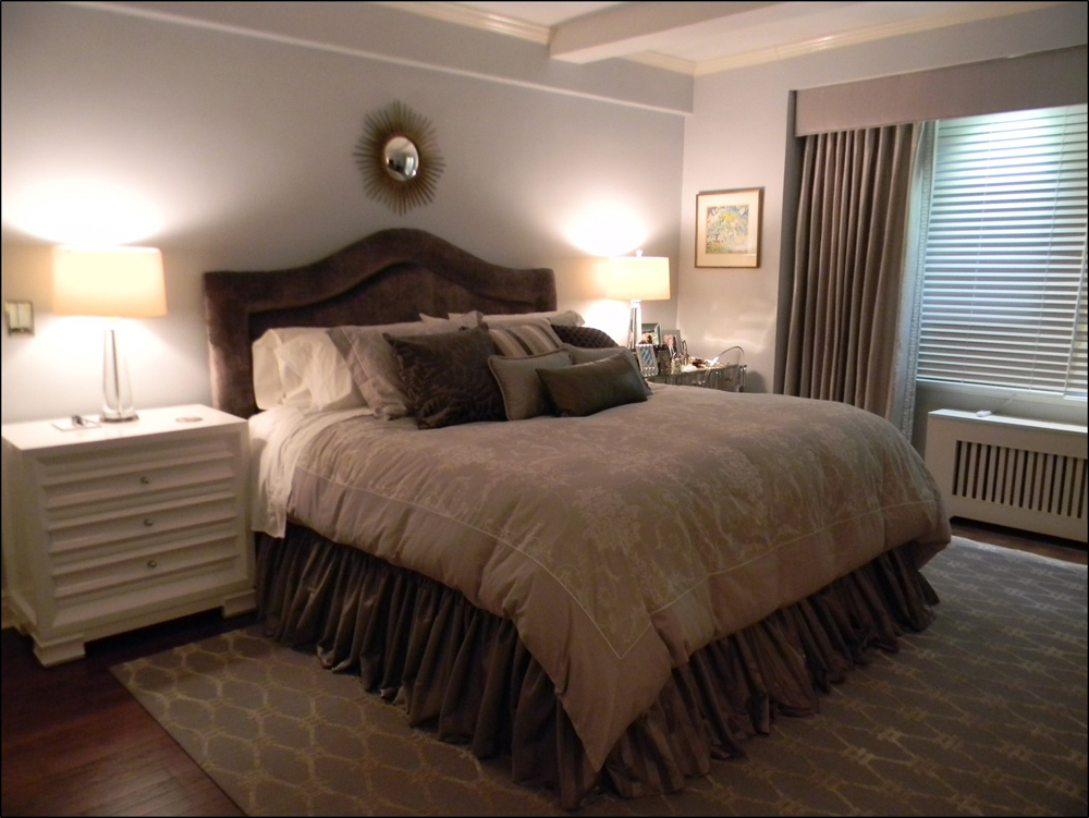
We chose a monochromatic color scheme; a variety of grays in walls, drapery, bedding and in the upholstered velvet headboard. The plush geometric design carpet pulls it all together to create a soft, peaceful and luxurious city retreat.
Powder room
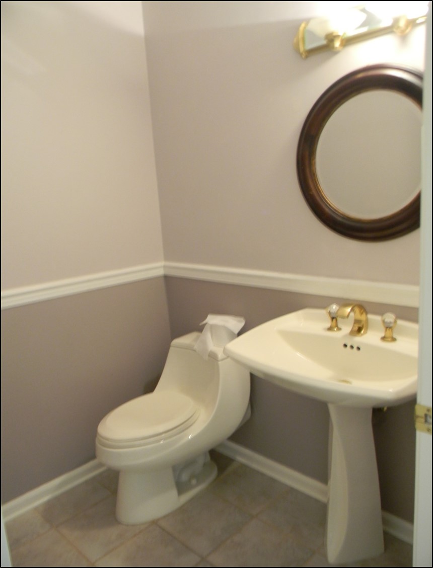
The original cool gray tones did not appeal to the homeowners, who very much prefer sunny, vibrant colors. They also did not like the gold faucet, framed mirror and vanity light.
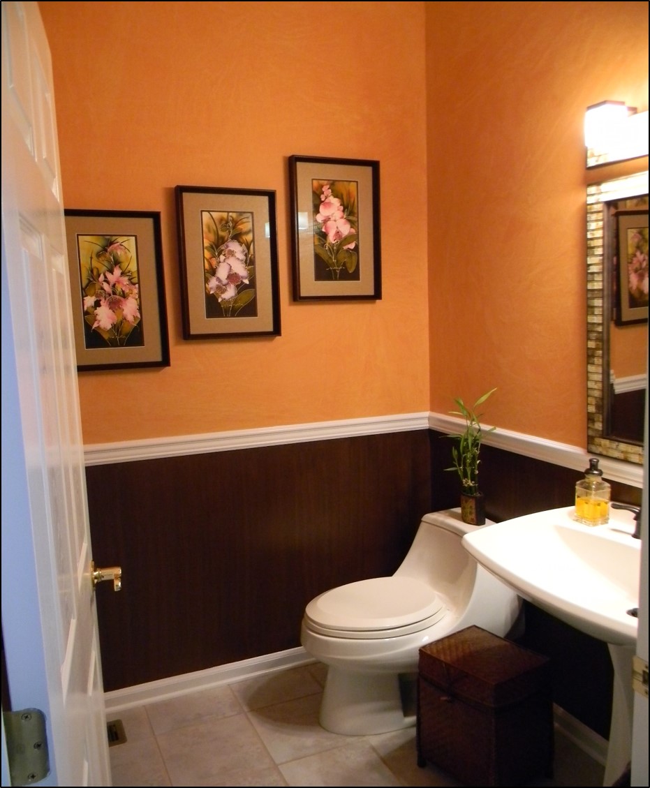
By applying two different decorative finishes to the walls, I gave this small space dimension and depth, warmth and a distinct style of its own. Organic stone and glass mosaics in mirror and light fixture, bronze faucet and bamboo accents now speak to the owners’ personality and style.
NYC Sitting Room
A NYC homeowner requested that this long, narrow space off the kitchen function 3 ways; as a sitting room, a dining room and as a guest bedroom. This was a tall order.
By incorporating a sleeper sofa, drop leaf dining table and movable chairs and ottoman, the owner gets her wish come true. When the table is down as shown, the room functions as a sitting room. In the open position the table seats 8 comfortably for dinner and the frosted French doors provide total privacy for overnight guests.
Senior Condo
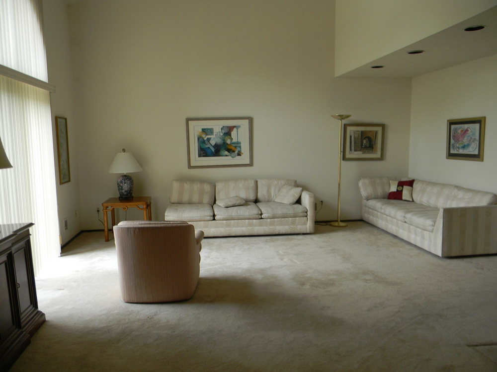
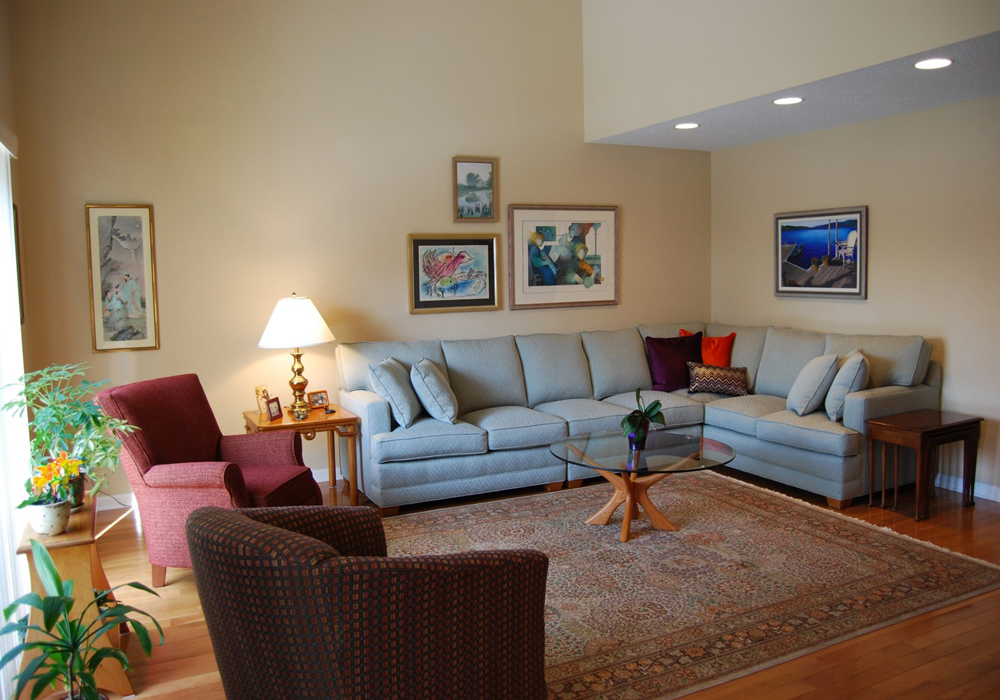
Active, working senior citizen requests a comfortable, updated look that she can feel proud of when entertaining family and friends.
A new hardwood floor, new wood moldings and color change on walls and trim transforms the semi-formal living room from cool/drab to warm/inviting. Recessed lighting was upgraded and black rims changed to white. New upholstered furniture in varying heights and shapes add color, texture and interest. Hand knottedPersian rug pulls together the room’s eclectic style.

